

Fitbump
My Role
Product Designer,
AR Designer
Skills
Skills
Timeline
2 weeks (2024)
Tools
2 weeks (2022)
Problem
Why We Built FitBump
Through secondary research and user interviews, we discovered common frustrations with existing fitness apps:
⚠️
Issues in current fitness apps
Overwhelming Metrics
Too many graphs, charts, and stats made users feel confused and discouraged.
Competitive Pressure
Features like leaderboards and comparisons often made users feel like they weren’t doing enough.
Rigid Goal-Setting
Strict, inflexible goals created pressure for users.
Our mission was clear:


The Challenge
How could we create a fitness experience that feels encouraging and stress-free, while still helping users achieve their goals?
Research and Insights
To understand what busy users wanted from a fitness app, we talked to five people from our focus group.
Research
To understand what busy users wanted from a fitness app, we talked to five people from our focus group.
Key Insights


Identifying Themes
We used affinity mapping to organize feedback from user interviews. By grouping similar responses, we uncovered key themes and user priorities, ensuring no critical insight was overlooked. This structured approach gave us a clear understanding of what users needed most.

Visualizing the Process
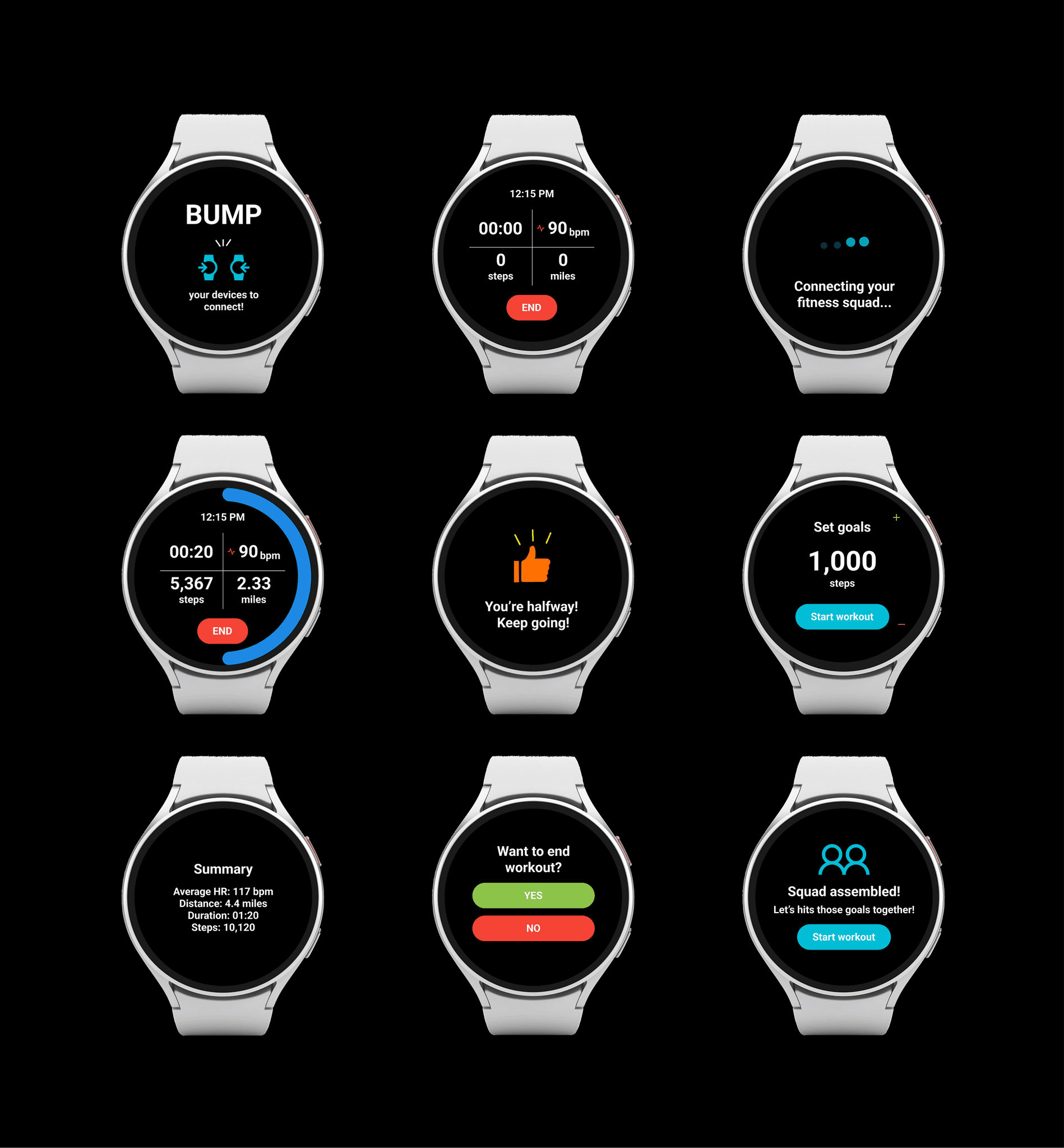
To make sure we stayed on track, we created a flow chart to map the user’s complete experience with FitBump—from onboarding to tracking their workouts and staying connected with friends. This helped us identify gaps, smooth out any rough spots in the user journey, and ensure every step felt easy and engaging.

Ideation
Early Sketches (Before)
Our early designs overloaded users with too many progress indicators and reward metrics, making it hard to focus. Overlapping visuals and unclear navigation created confusion, while the "connecting" feature lacked clear instructions on interaction. Including both competition and companion models made the experience overwhelming instead of intuitive.


Refined Sketches (After)
The refined sketches focused on creating a seamless user experience by visually enhancing core features. Circular progress tracking was designed to provide clear, satisfying feedback at a glance. The "Bump" feature was polished for intuitive interaction to foster social engagement, and motivational messages were integrated with thoughtful placement to keep users inspired throughout their workouts.

Why the changes?
User testing revealed frustration when faced with cluttered layouts and complicated flows. Feedback like, “I don’t know where to look first,” told us to focus on clarity. By testing simpler versions, we saw that streamlined designs reduced confusion and increased excitement.
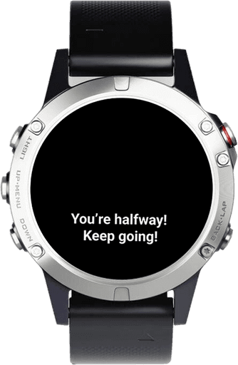
Set a fitness goal, track progress with a growing radial bar. Each step forward feels achievable and worth celebrating.
Motivational messages
Results
Usability Test
Users found the "End Workout" screen unclear and buttons too small, so we adjusted the wording and increased button size. FitBump required clearer instructions, and interest in a weekly workout summary was noted for potential future updates.

Measurable Impact
The refined sketches focused on creating a seamless user experience by visually enhancing core features. Circular progress tracking was designed to provide clear, satisfying feedback at a glance. The "Bump" feature was polished for intuitive interaction to foster social engagement, and motivational messages were integrated with thoughtful placement to keep users inspired throughout their workouts.
Why the changes?
User testing revealed frustration when faced with cluttered layouts and complicated flows. Feedback like, “I don’t know where to look first,” told us to focus on clarity. By testing simpler versions, we saw that streamlined designs reduced confusion and increased excitement.
Reflection
Real-World Challenges We Faced

How We Prioritized Goals
By leaning on research, we always asked,
“Does this feature solve a problem for the user?”
Then we tested, iterated, and kept the features that resonated most with people.

Develop smarter notifications based on user habits, like reminders to stretch on rest days.

Allow users to share progress with larger groups or join workouts virtually.
Gamification
Introduce challenges and small rewards for consistent effort, like badges for streaks of activity.

Weekly Summaries

Why This Matters
FitBump isn’t just another fitness tracker. It’s about empowering users to celebrate real progress, stay motivated, and connect with others along the way. Fitness isn’t about perfection, it’s about meaningful, honest growth.
This case study shows how great design comes from understanding people first, then creating solutions that actually fit into their daily lives.